Obsessive Compulsive Disorder
For this brief I was tasked with creating an ad campaign around my chosen disorder. For this project I chose OCD. I did this as I feel there haven't been many campaigns around this allowing me to create something unique. I feel many people are misinformed about OCD and my campaign could help with that.

I decided to create a set of four posters for this ad campaign. Each poster represents one aspect of OCD. I did this to help inform people on every aspect of the mental disorder, and felt there was too much information for a single poster.

I decided to design my campaign using the Bauhaus style. I chose this as I felt it was a very eye catching style that would draw viewers in and help it to stand out from its surroundings. Not only this I felt the busy nature of the style would represent the busy mind and thoughts of someone facing OCD

A big theme in Bauhaus is to use bold bright colours. Because of this, I chose contrasting colour palettes; this then helps each part of the poster differentiate itself. Not only this, I feel it again helps the poster to stand out from the surroundings and draw viewers attention to the poster. I used four different colour palettes for each poster. This would help highlight the fact each poster is about a different aspect of OCD whilst still making sure they worked as a coherent set of posters.

For my type, I chose to use a bold sans-serif font. I chose this for its scalability and accessibility for a wider audience of people. I also felt it complimented the Bauhaus style and the use of a contrasting white helped it stand out from all the colours around it.


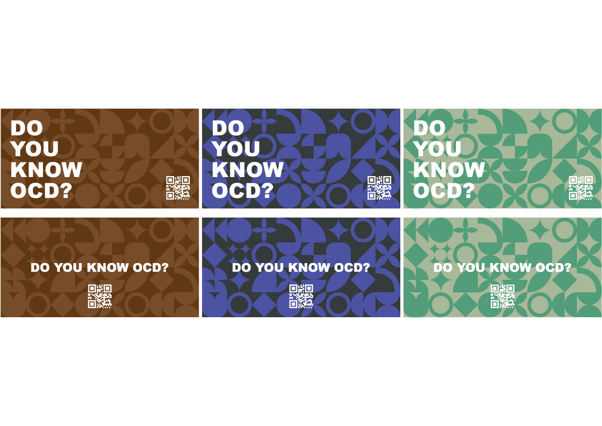
Here I have designed a set of billboards. For this design, I took what I had done with my posters and stripped it back. I chose to do this as billboards are meant to be viewed from cars - because of this many people only have 5-10 seconds to take in an advert and so billboards need to be easy to view in a short amount of time.

For the type, I stripped back the amount of information to a simple statement and a call to action with my use of a QR code. This was all done in the same blocky bold sans-serif type at a larger size. This plus the use of contrasting white helps draw the viewer's attention to it whilst helping it stand out from the background.

For the colour pallete, I chose to create 3 different colour palettes based on my posters however I only used 2 of the 5 colours from each. I chose to do this as brighter colours may not work in the chosen environment the billboard is placed in. On top of this, bright colours may blind drivers or cause the text to be illegible. To combat this, I used darker contrasting colours to help the pattern show through whilst still making the text readable for cars driving past.

